


It's a rough draft, but I'm pretty happy with it.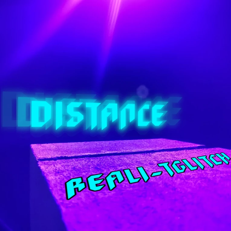
I am Reali-tGlitch/Echo Ex Machina/Phrieksho. I have been making music officially since 07, technically since 04. As Phrieksho I stream on Twitch and make gaming related content. Aspiring voice actor, feel free to contact!
Christopher Castellore
@Reali-tGlitch
Age 31, Male
Westlake High School (2012)
Seattle, WA
Joined on 1/16/07
- Level:
- 28
- Exp Points:
- 8,470 / 8,700
- Exp Rank:
- 4,947
- Vote Power:
- 6.97 votes
- Audio Scouts
- 2
- Rank:
- Police Officer
- Global Rank:
- 14,683
- Blams:
- 276
- Saves:
- 388
- B/P Bonus:
- 10%
- Whistle:
- Normal
- Medals:
- 286
- Supporter:
- 7y 10m 27d
- Gear:
- 2
vekoN
honestly, i'm not vibing with this. the composition is unbalanced (the text and stone-looking thing aren't centered, leaving a lot of awkward empty space), the color pallete isn't striking (maybe add some greens or contrasting colors?), and the font looks corny, too amateurish. i don't really see the aesthetic this is trying to convey, which is the most important aspect an album cover should nail imo
really if possible i'd try centering the stone more or have it take up more of the space, use a more clean, modern sans serif font and do away with that gradient effect, and try adding more details in contrasting colors
Reali-tGlitch
The background is actually a picture I took at my workplace, one of the lights in our escape room is cut off from the daisy chain and stuck on as a result lol. I have some alternate ones I could use but the pillar is rotated in them, which I wasn't as fond of. the idea was like looking off into the abyss.